CELEBRATING 100 YEARS OF LONDON’S UNDERGROUND ICONIC FONT.
It seems ironic, if not mildly amusing, that one of the most urban of signifiers of all – the famous London Underground typeface – was dreamt up in a small Sussex village” writes Wallpaper’s Sam Rogers. “And yet it was. That same lettering is celebrating its 100 anniversary this year, so in tribute, the Ditchling Museum of Art + Craft is putting on a show.” Aptly named ’Underground: 100 years of Edward Johnston’s Lettering from London’ is a cultural event customised for the fontlover. The exhibition marks the centenary of Johnston’s world famous typeface for London Underground which has barely changed over 100 years, “a testament to its success as station way finders.”
“Johnston’s remit was to unite the London Underground Group, the different companies all using the same rails and tunnels,” says Donna Steel, curator of a new exhibition about Edward Johnston and his influence on printing at the Ditchling Museum of Arts and Crafts in East Sussex to BBC.
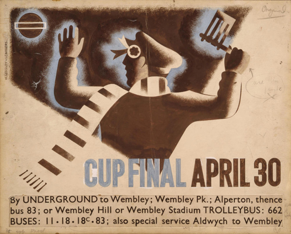
Cup final, Tom Eckersley and Eric Lombers
“All the advertising, all the signage was all completely different – there was this cacophony of letters. Johnston applied the proportions of Roman capital letters to his typeface, so it was rooted in history, rooted in traditional calligraphy. But it has an elegance and a simplicity that absolutely fitted the modern age” she continues.
Hand drawn by Johnston whilst living in Ditchling this alphabet is gloriously simple, but its design is rooted in much earlier lettering since it bears the proportions of Roman capitals. The design was initially proposed in 1913 by Frank Pick, commercial manager of London Underground Railway as a joint project for Edward Johnston and Eric Gill. Yet Gill was unable to proceed since he had agreed to a major commission of Stations of the Cross stone reliefs for Westminster Cathedral.
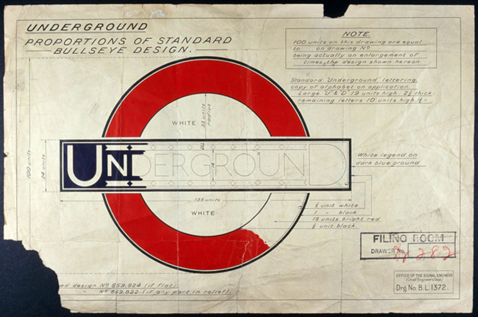
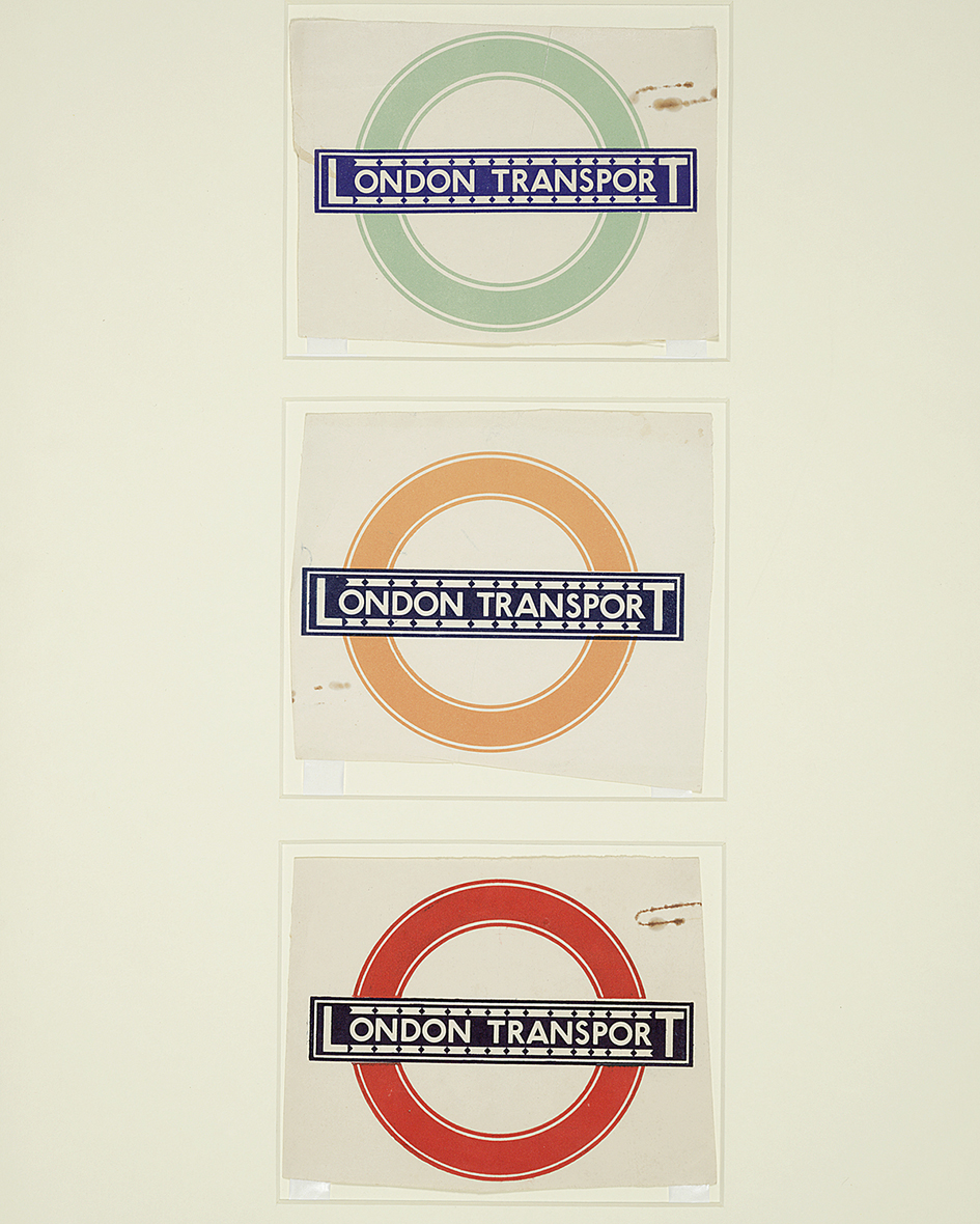
Original drawing for the London Underground roundel symbol Design: Edward Johnston © TfL/London’s Transport Museum
Johnston’s typeface is known variously as Underground, or Johnston Sans. It is also known as the basis on which Eric Gill, one of Johnston’s first pupils at Central School of Arts & Crafts, designed his typeface Gill Sans for the Monotype Corporation, released in 1928. With similar proportions to Johnston’s earlier typeface, it was initially criticised for being too similar but both Johnston Sans and Gill Sans have become modern classics. Just by reading Johnston’s instructions sent to London Transport’s printers, you feel his sensitivity towards the font:
“In normal Block Letter Capitals (based on the approximately circular O) the limit of Weight is determined by one (or both) of two considerations. 1st by the effect on the transversely divided Caps A B E F P R & to a less extent on H G K X Y. 2nd When a “lower case” (or “small letter”) – “l.e.” Is used, to match the Capitals. (Note: it is convenient to express the Weight of a letter by the stem-width of thickness compared with the Stem-Height…)
1st in a transversely divided letter of a very heavy make there may be very little, or even insufficient, Background (especially above the transverse bar). Compare two heavy Es. It is seen that in E of W + H over 5 the upper & lower parts of Background xx are about the same width or thickness as the E’s arms or stem.”
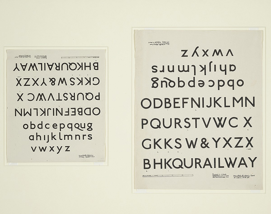
One inch monoline sans serif Underground, or Johnston Sans type designs by Edward Johnston, 1916.
Born in Uruguay, this exhibition shows Johnston as a true man of letters, resurrecting and redefining calligraphy in the West, and designing an elegant typeface for London Underground. Highlights include Johnston’s calligraphy for W R Lethaby which secured his post as a teacher at Central School of Arts & Crafts; manuscripts showing his development as a calligrapher; rarely seen working drawings of the Underground typeface, and original drawings for Gill Sans.
An “authentic lettering of the 20th century” the typeface aimed for nothing more than consistency and clarity. “Ever the purist, Johnston went back to his calligraphy roots and simplified the Roman letters down to their very essence, distilling along the way a visual identity that endures today. (The font was only updated once, and ever so slightly, in 1979)” writes Rogers.
Bulls Eye, © Crafts Study Centre
Yet this is just one of the many celebration Ditchling Museum of Arts and Crafts has organised for this a summer that is dedicated to Johnston. The museum has created a giant and unorthodox method of printing Johnston Sans – a 12.5 ton steamroller according to the BBC’s Dan Damon report.
“We’re going to make some huge, laser-cut Johnston wood types, ink them up with a really big roller, lay very large sheets of paper over the top, and then drive over it with a steamroller” says Nathaniel Hepburn, director of the Museum. “The typeface is seen before any of the words are ever read.”
A century ago this iconic typeface was created and it is as contemporary as London. This is British typography at it’s best.
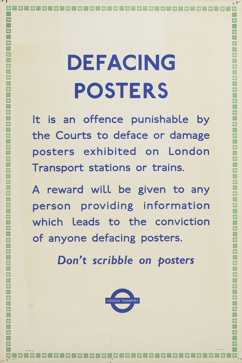
Defacing Posters, © Victoria & Albert Museum, London
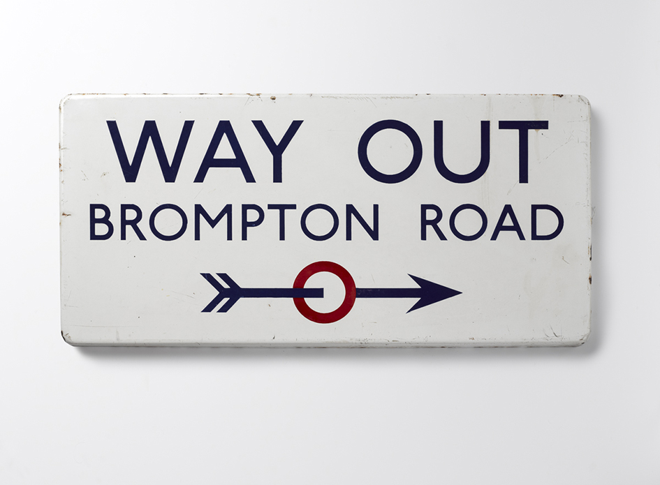
Way Out sign at Brompton Road, 1916, © Ditchling Museum of Art + Craft
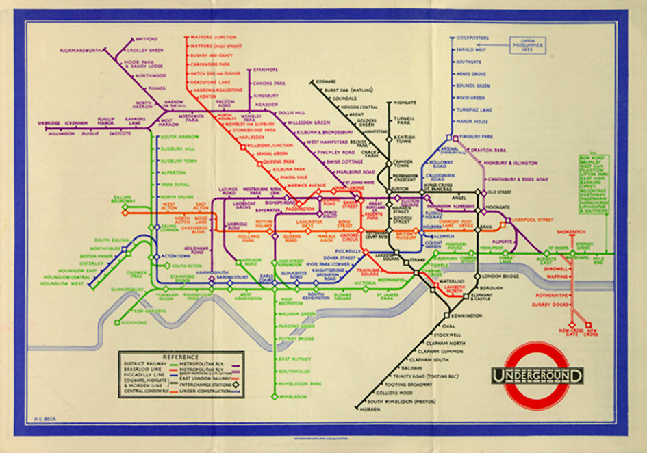
Pocket Underground Map, 1933
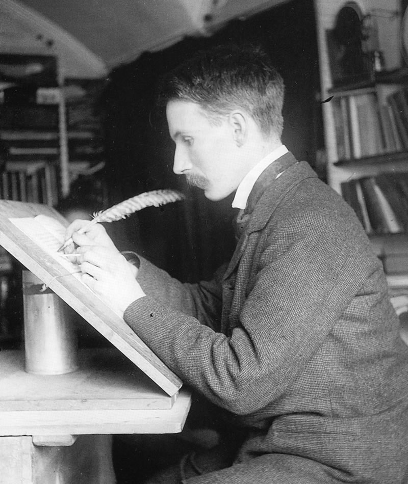
Edward Johnston at his desk
Source: typeroom.eu © 2017 All rights reserved. Typeroom is published by Parachute®