HAPPY 90TH ANNIVERSARY FUTURA! THE BOOK THE FONT AND STANLEY KUBRICK.
Edited by Petra Eisele, Professor of Design History and Design Theory at the University of Mainz, Dr. Annette Ludwig, Director of the Gutenberg Museum and Isabel Naegele, Professor of Typography at the University of Mainz this stunning book tells the story of the iconic font which redefined the graphic design in it’s own ways, Futura.
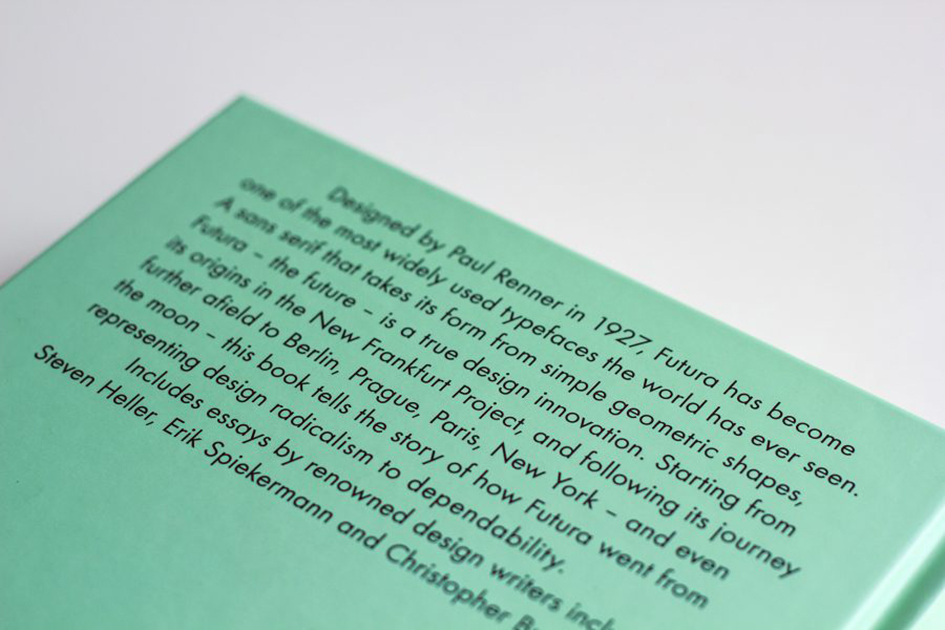
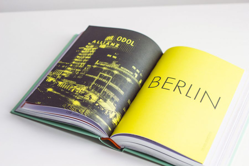
This is a stunning examination of one of the most popular typefaces ever created. Celebrating its 90th anniversarythis year, the story of Futura is a fascinating one. Charting its Bauhaus origins to its use as the first font on the moon in 1969, this book tells the story of how the typeface went from representing radicalism in design to dependability. It is durable and timeless, and is worthy of being rediscovered and celebrated.
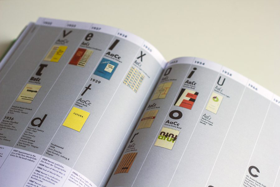
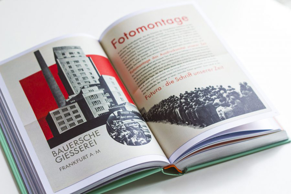
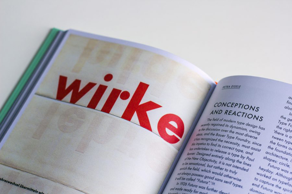
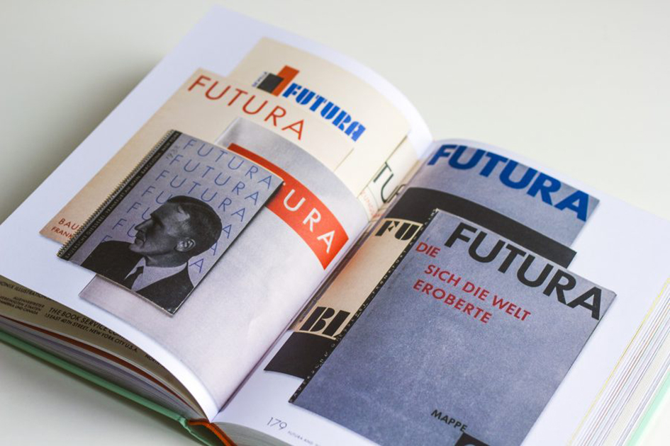
Futura is a geometric sans-serif typeface designed by Paul Renner and released in 1927. It was designed as a contribution on the New Frankfurt-project and it is based on geometric shapes that became representative of visual elements of the Bauhaus design style of 1919–33. It was commissioned as a typeface by the Bauer Type Foundry, in reaction to Ludwig & Mayer’s seminal Erbar of 1922.
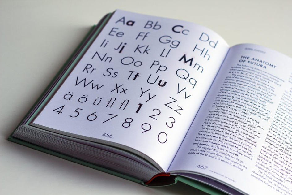
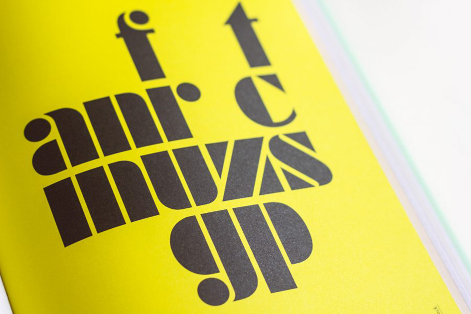
Futura has an appearance of efficiency and forwardness. Although Renner was not associated with the Bauhaus, he shared many of its idioms and believed that a modern typeface should express modern models, rather than be a revival of a previous design. Renner’s design rejected the approach of most previous sans-serif designs (now often called grotesques), which were based on the models of sign painting, condensed lettering and nineteenth-century serif typefaces, in favor of simple geometric forms: near-perfect circles, triangles and squares. It is based on strokes of near-even weight, which are low in contrast. The lowercase has tall ascenders, which rise above the cap line, and uses a single-story ‘a’ and ‘g’, previously more common in handwriting than in printed text. The uppercase characters present proportions similar to those of classical Roman capitals.
Different sans-serif designs take different decisions on the proportions of the capitals. Futura’s capitals are inspired by Roman square capitals, with considerable variation in width. Helvetica’s are more uniform in width, following the grotesque model. Different designers have expressed different opinions on which style is preferable.
Paul Renner began sketching his letters that would become Futura in 1924; the typeface was available for use three years later.
Despite its clean geometric appearance, some of Futura’s design choices recalled classic serif typefaces. Unlike many sans-serif designs intended for display purposes, Futura has quite a low x-height, reducing its stridency and increasing its suitability for body text.
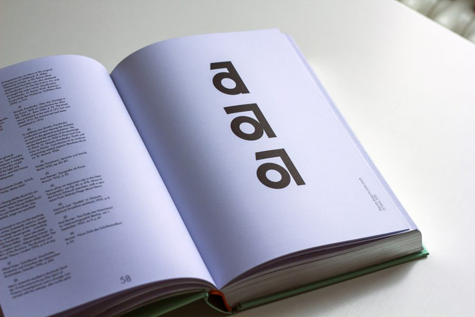
The design of Futura avoids the decorative, eliminating nonessential elements, but makes subtle departures from pure geometric designs that allow the letterforms to seem balanced. This is visible in the apparently almost perfectly round stroke of the o, which is nonetheless slightly ovoid, and in how the circular strokes of letters like b gently thin as they merge with the verticals. Renner’s biographer Christopher Burke has noted the important role of the Bauer Foundry’s manufacturing team in adapting the design for different sizes of text, a feature not seen in digital releases.
Futura was immediately very successful, due to its combination of classicism and modernity. It spawned a range of derivative geometric sans-serif typefaces from competing foundries, particularly in the United States.
In the UK Futura, while sometimes used, was overshadowed by Gill Sans, which became popular for similar reasons in the UK and came to define 1930s and 40s printing. While more humanist, it also has geometric leanings which are particularly visible in the capitals.
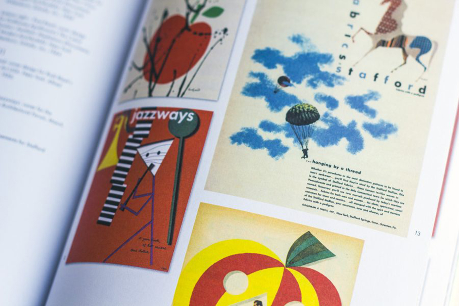
Futura remains an important typeface family and is used on a daily basis for print and digital purposes as both a headline and body font. The font is also used extensively in advertisements and logos, notably by IKEA (until 2010), Supreme, Party City, Volkswagen, Royal Dutch Shell, Crayola, FremantleMedia and HP in their print ads.Particularly until the 1950s it was used extensively by the publishing industry as a general-purpose font.
The font has been used extensively in film and video. It is used for the title logo of the 1999 film American Beauty. It was also used in various TV shows including Doug, Lost, Warehouse 13, the American version of Sesame Street, which had the capital “I”, lowercase “j”, and numbers “1” and “4” in simplified forms, etc. Futura is featured ubiquitously throughout the film adaptation of V for Vendetta, for everything from the title logo and ending credits, to signs, newspapers, computer screens and other props. Wes Anderson is fond of the font and used it in some of his films. Futura was also Stanley Kubrick’s favorite typeface.
“Futura: The Typeface” by Petra Eisele, Annette Ludwig and Isabel Naegele includes essays written by renowned design writers including Steven Heller, Erik Spiekermann and Christopher Burke and is published by Laurence King.
Grab your own copy here
Source: typeroom.eu © 2017 All rights reserved. Typeroom is published by Parachute®
MORE ABOUT FONTS: LETRASET /