THE NOSTALGIC AND VERY DIY TYPOGRAPHIC REVOLUTION EXPLAINED.
Some products are inextricably infused with nostalgia. Letraset is one of them” writes Kathryn Westcott for BBC. “Sheets of film that would be rubbed with the end of a pencil to give way to beautifully formed letters – as long as you had a steady hand and the patience of a saint” she adds on the revolutionary Letraset which changed typographyin 1961 with graphic designers, architects and numerous amateur publishers of zines “embracing it with gusto”.
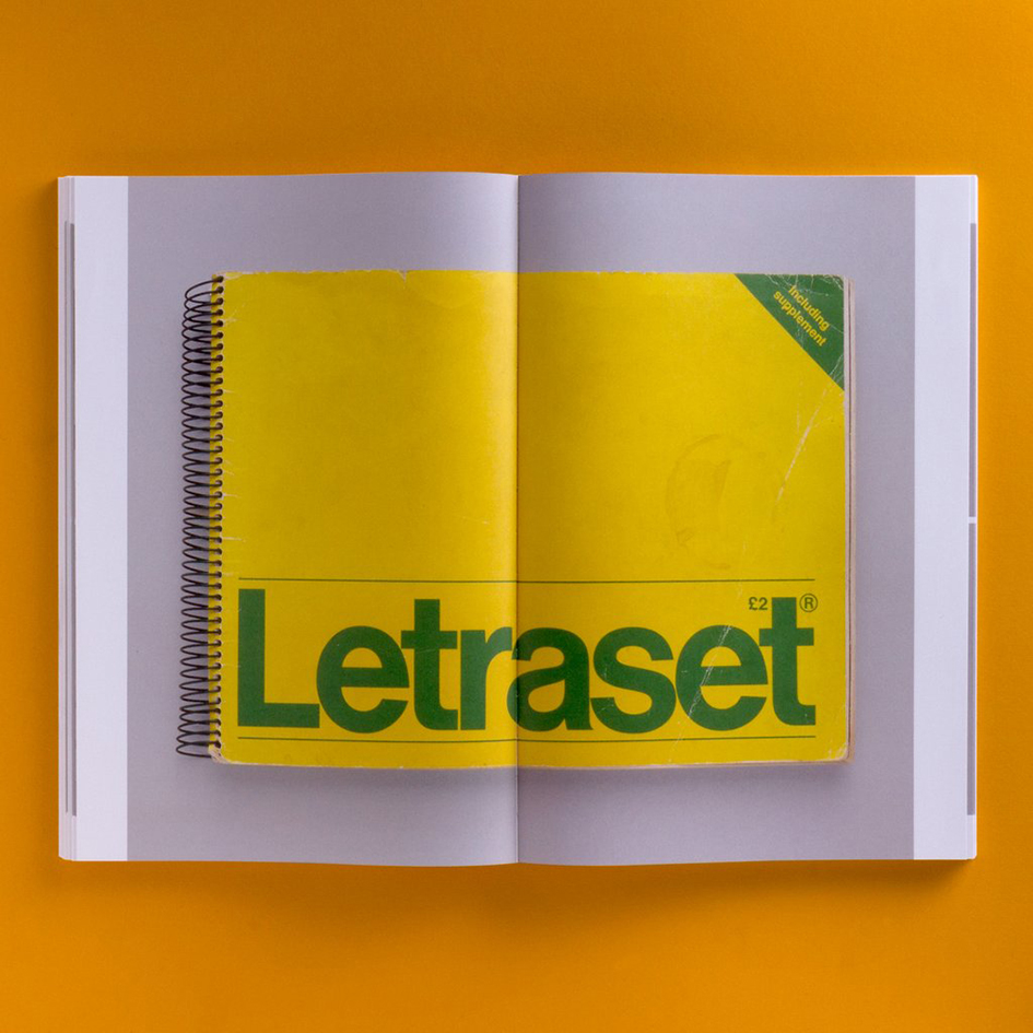
Now, after four years in the making, Unit Editions presents us with “Letraset: The DIY Typography Revolution”, literally the first comprehensive history of the rubdown lettering system that revolutionised typographic expression.
The book tells the Letraset story from its early days as a difficult-to-use wet system, to its glory years as the first truly democratic alternative to professional typesetting. The book also looks at Letraset’s present-day revival amongst a new set of admirers who recognise the typographic excellence of the system’s typefaces.
Essays by Colin Brignall, Dave Fairey and Mike Daines – all key members of the Letraset team – provide expert insight into the rise of Letraset as a typographic and commercial powerhouse. A central essay by Adrian Shaughnessy examines the typographic and cultural impact of the system.
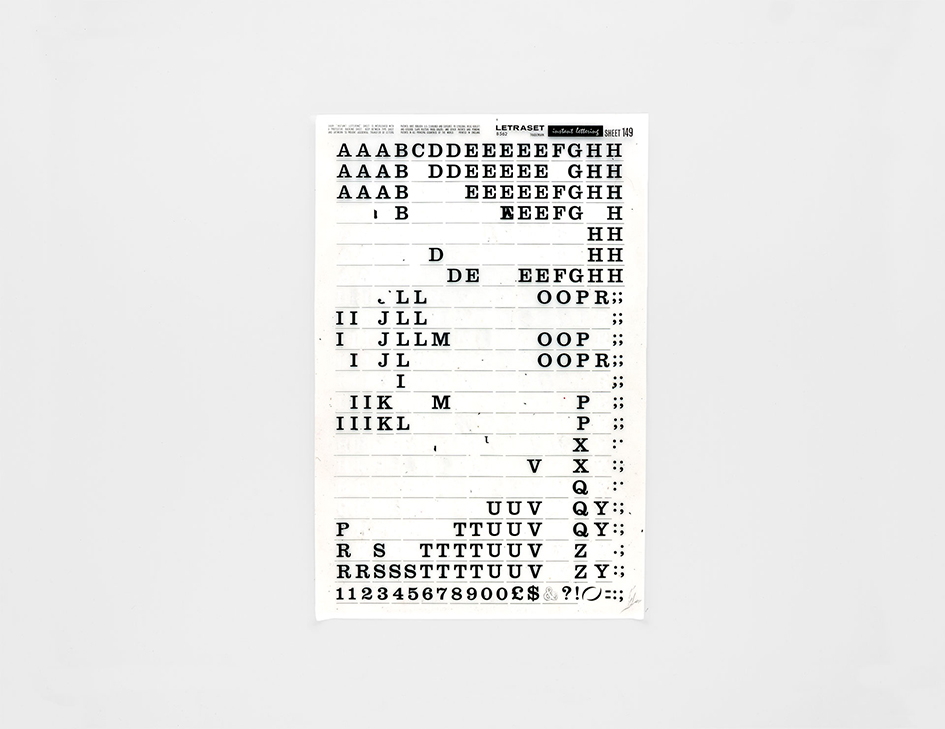
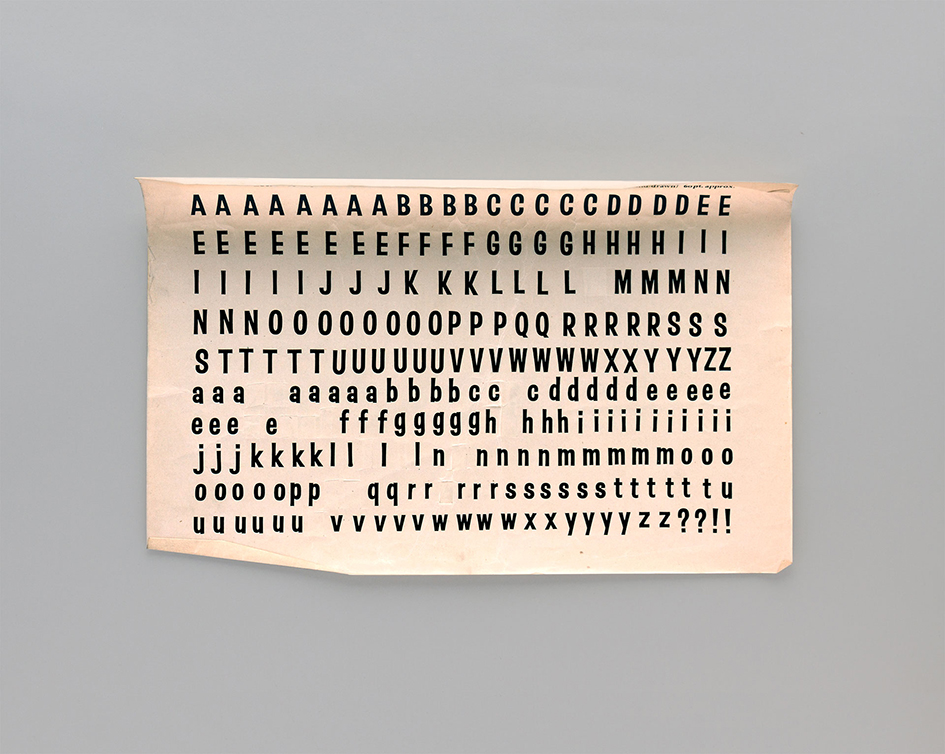
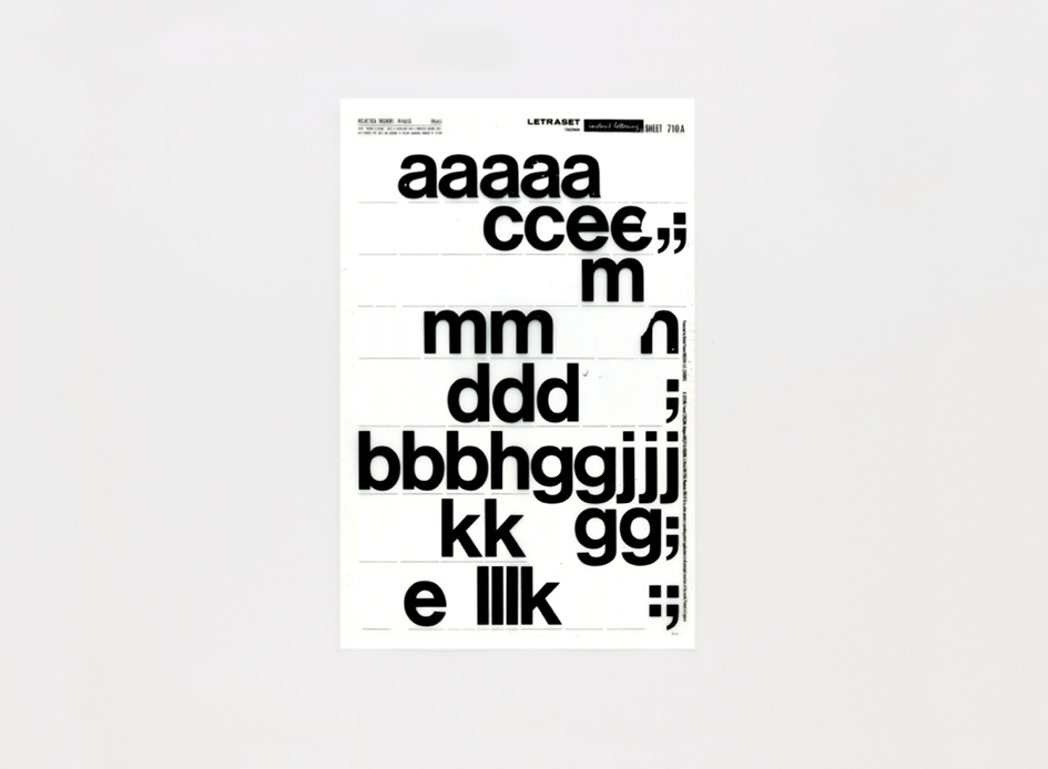
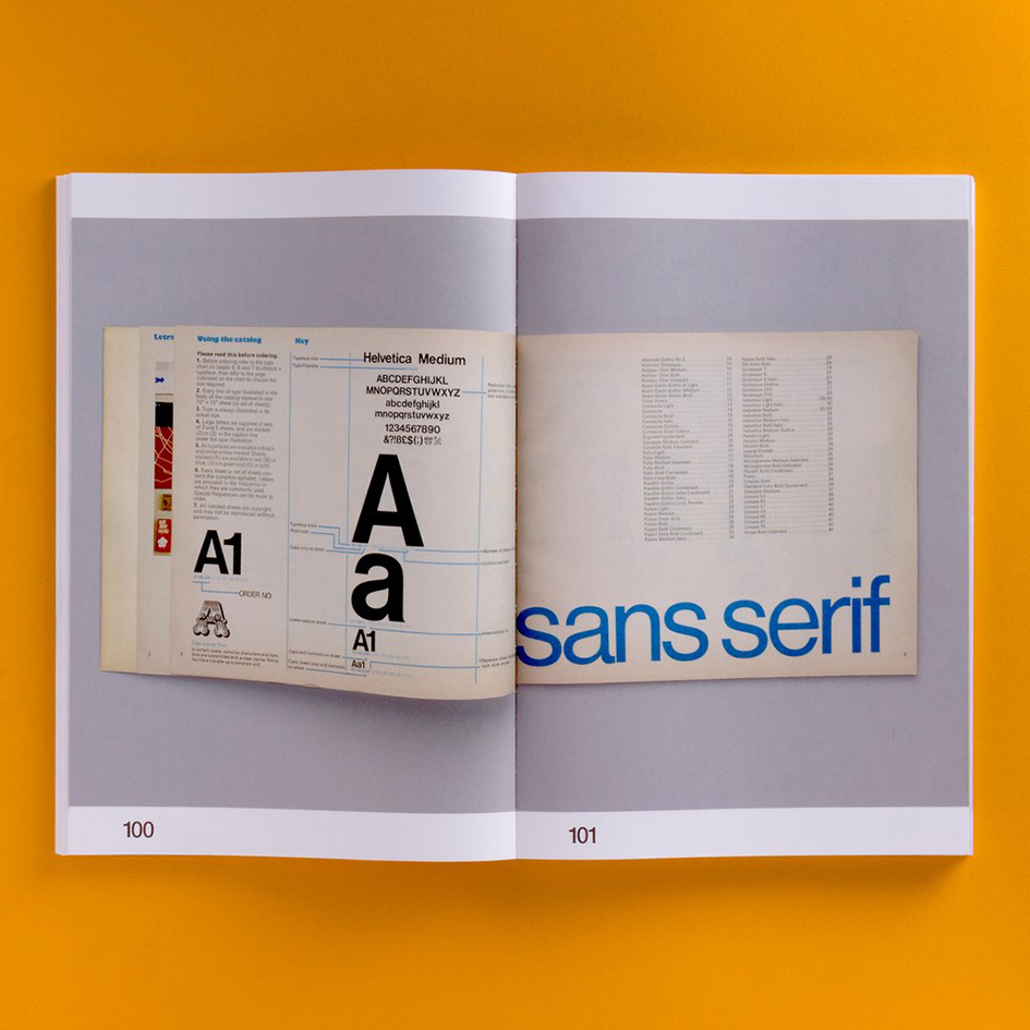
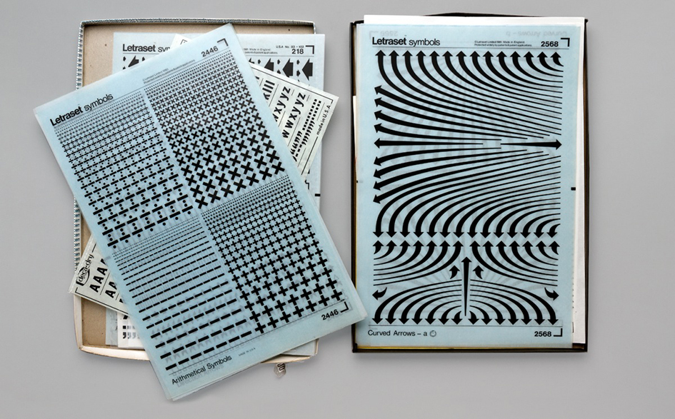
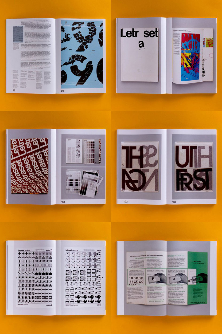
The book’s design is by the Spin team of Tony Brook and Claudia Klat. It uses many rare specimens from Letraset’s past – catalogues, press ads, mailers, storage units, and of course, sheets of classic Letraset typefaces.
The book comes with a gatefold Letraset timeline. It has an introduction by Malcolm Garrett, and features in-depth interviews with Mr Bingo, Erik Brandt, Aaron Marcus, David Quay, Dan Rhatigan, Freda Sack, Andy Stevens and Jon Wozencroft.
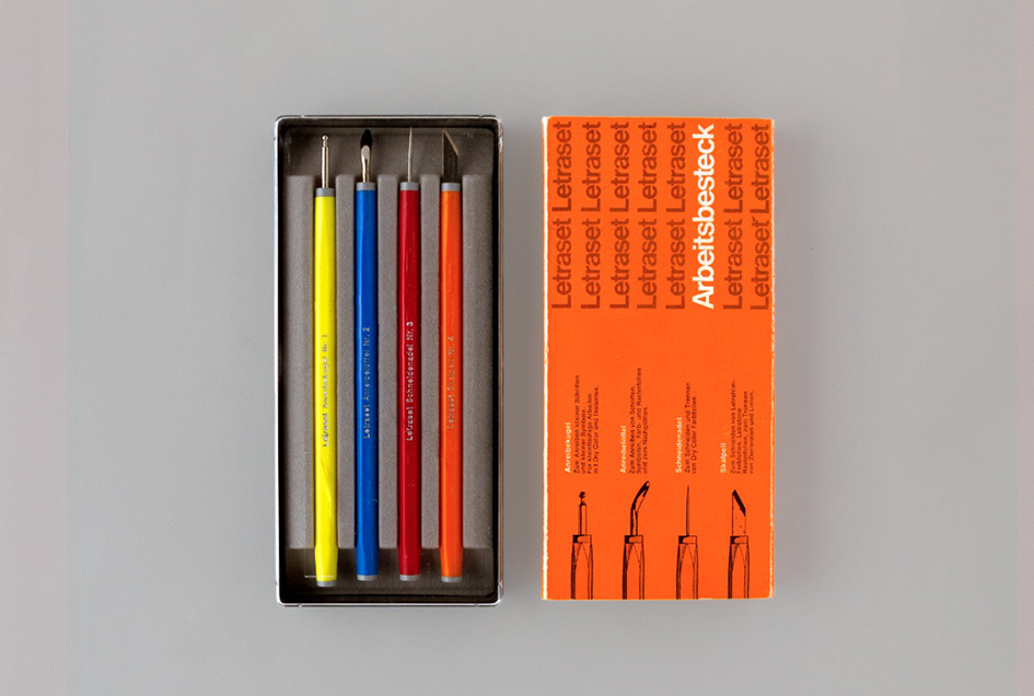
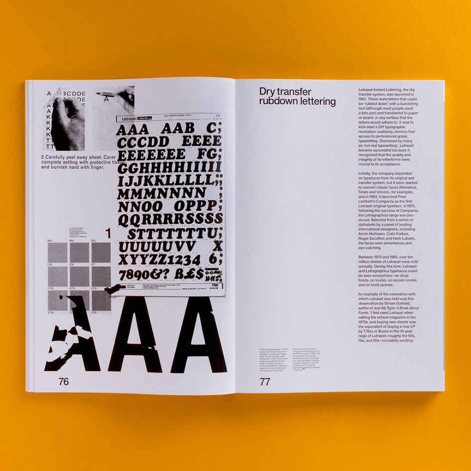
The Letraset business was founded in London in 1959, introducing innovative media for commercial artists and designers. Their original product was the Letraset Type Lettering System and by 1961, Letraset’s dry rub-down Instant Lettering was perfected. This was to be their core product for many years to come.
Starting in 1964, Letraset also applied the dry rub-down transfer technique to create a children’s game called Action Transfers, which would later develop into Kalkitos (marketed by Gillette) and many other series of transferable figures that were very popular up to the 1980s.
Seeing a decline in the sales of their materials in the early 1990s, Letraset moved into the desktop publishing industry, releasing software packages such as ImageStudio and ColorStudio for the Macintosh. These never saw widespread success. However, as Letraset held the rights to their fonts that had been popular on the dry transfer sheets, it made sense to enter the digital font market (see, for example, Charlotte Sans). Letraset thus began releasing many fonts in formats such as PostScript.
Fonts from designers such as Alan Meeks, Martin Wait, Tim Donaldson and David Quay were released, and many can be found on online retailers such as Fontshop. Some fonts retain ‘Letraset’ in their title, whereas others have been renamed by their new vendors such as ITC.A selection of fonts is still sold from their web site, separated into fonts from Fontek and Red Rooster. Software include Manga Studio EX and Envelopes, a plug-in for Adobe Illustrator.
Letraset was a company based in Le Mans, France having previously been based in Ashford, Kent,until being acquired in June 2012 by the Colart group and becoming part of its subsidiary Winsor & Newton.
Read the story of a typographic adventure here
Source: typeroom.eu © 2017 All rights reserved. Typeroom is published by Parachute®
MORE ABOUT FONTS: FUTURA /