HELVETICA TURNS 60 SO HUSMEE’S TRIBUTE IN 20 POSTERS IS A THING
Ten years ago a documentary on Helvetica’s dominance in the graphic design world celebrated the font’s 50th anniversary. Made by Gary Hustwit in 2007 Helvetica is a feature-length independent film about typography, graphic design and global visual culture which looks at the proliferation of one typeface as part of a larger conversation about the way type affects our lives. Ten years on Helvetica is still celebrated, this time with Husmee graphic design studio in charge of a beautiful, inspiring tribute made in posters.
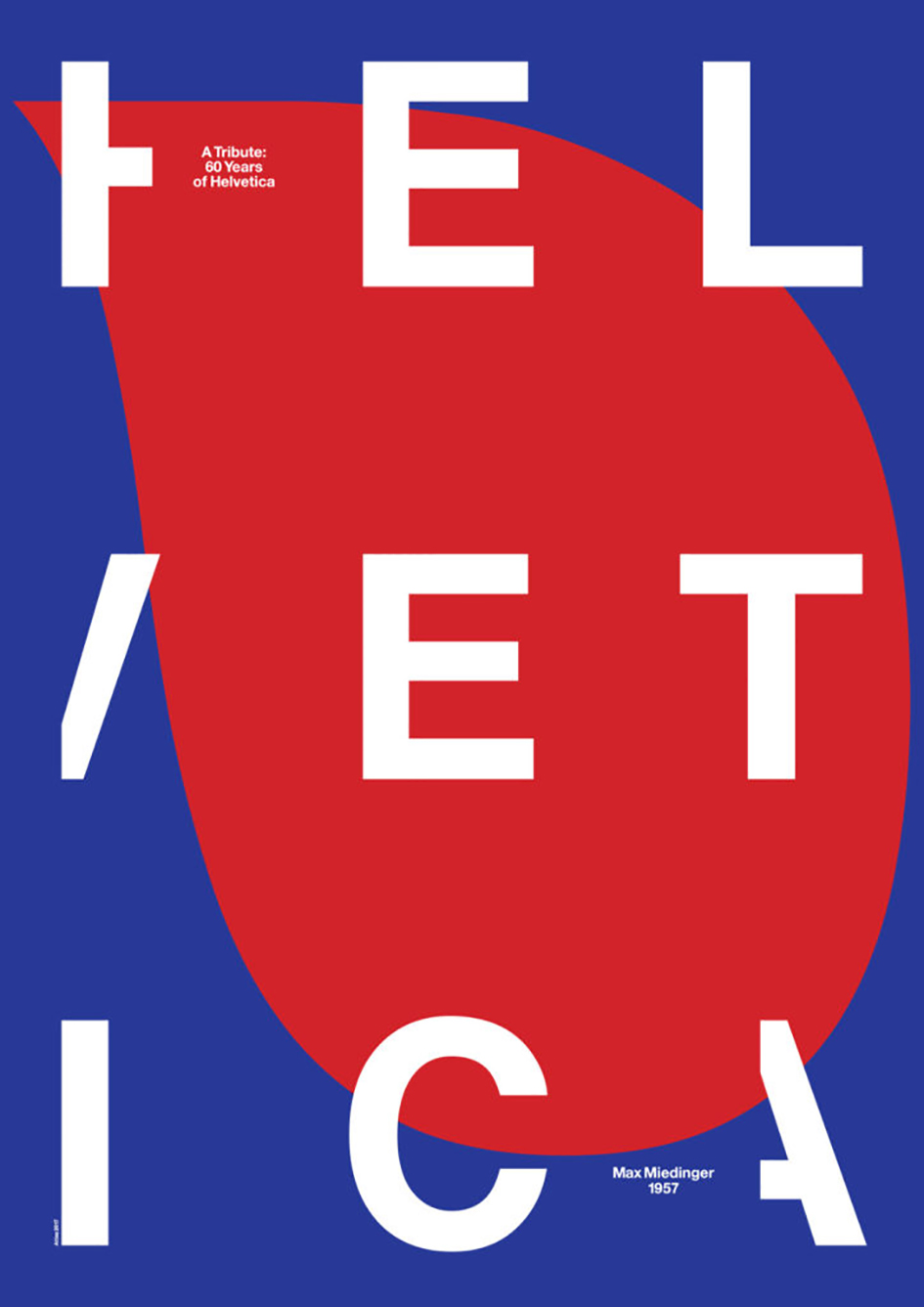
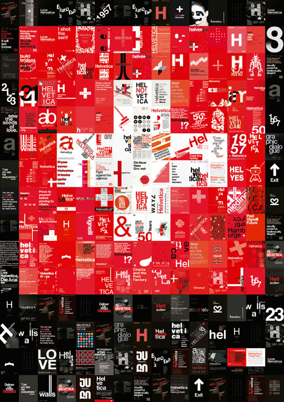
A decade on, its being celebrated more modestly but no less stylishly – with a set of specially commissioned posters. Spanish studio Husmee – which turns 10 this year – has released 20 posters by some of the great graphic designers to mark the typeface’s 60th anniversary with Build, Graphical House, Hey Studio, Spin and Toko, Javier Mariscal and Patrick Thomas being among the contributors who gathered to celebrate the sans-serif designed in 1957 by Max Miedinger and Eduard Hoffmann this is a project to adore.
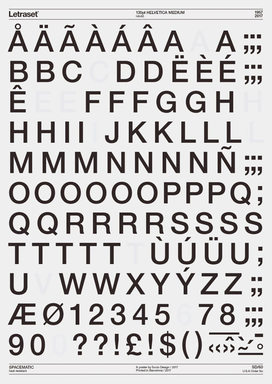
Poster by Socio Design
“This year Husmee celebrates its 10th anniversary and, as part of this celebration, we have created and organised this tribute to the Helvetica typeface on its 60th anniversary. Each one of the participant studios has designed a poster dedicated to this great typeface and they had total freedom for developing their works”.
“The aim of the project was that the outcome showed a diverse group of designs. We thought it would be enriching to display these different points of view and, with the posters being already published, we can say that the project for this 60th anniversary has achieved this goal. We believe that this is an absolute tribute. It is not an ordinary or artificial but diverse and true project that will acclaim, criticise, adore, and open a debate about this typeface” adds Husmee who surely know how to pay a tribute. Kind reminder: Husmee displayed 53 such works by top-notch designers including Milton Glaser, Build, Graphical House, Javier Mariscal and Magpie, to mark the first anniversary of the death of Italian designer Massimo Vignelli.
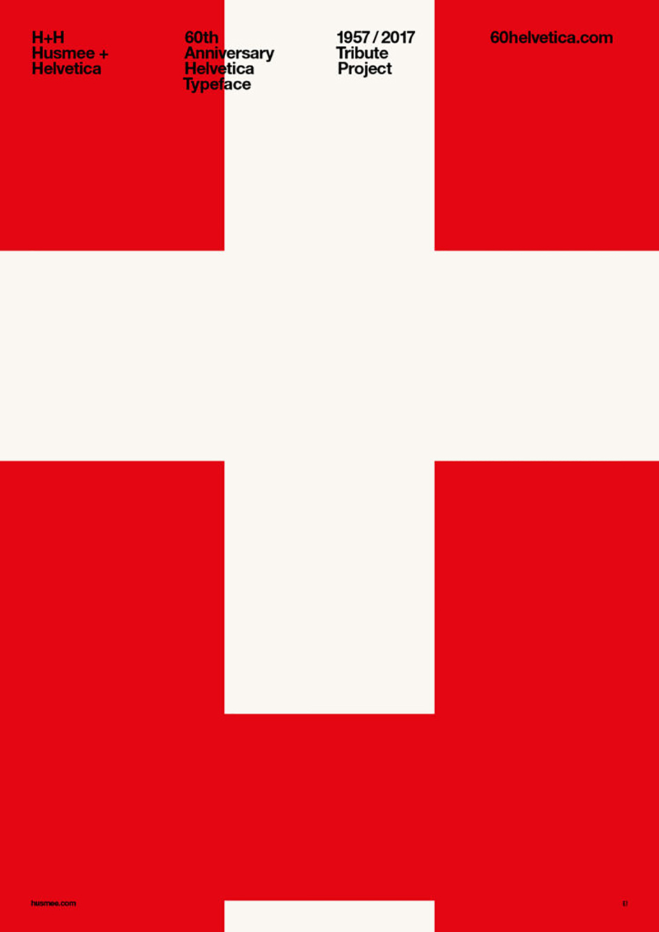
Poster by Husmee
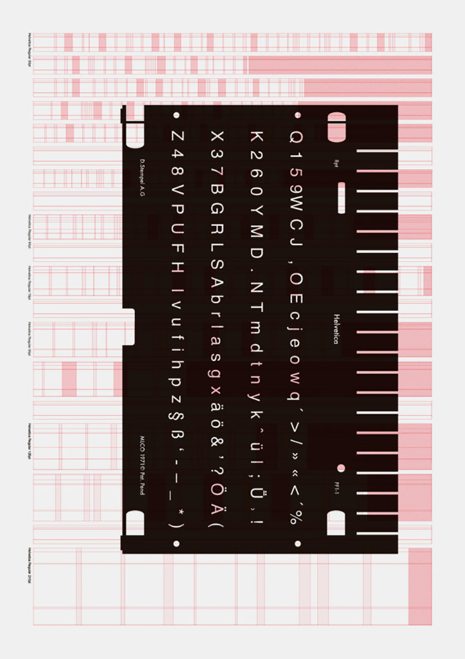
Husmee Studio has worked with paper company Arjowiggins to bring together this celebration of the 60th anniversary of Helvetica. The list of participating studios is as follows: Atlas / Build / BVD / Empatía / Graphéine / Graphical House / Hey Studio / Husmee / Javier Mariscal / Mario Eskenazi / Mash Creative / Monumento (Ex Face) / Oscar Mariné / Patrick Thomas / Estudio Pep Carrió / Socio Design / Spin / Toko / Toormix / Waterhouse Cifuentes Design (Ex Vignelli Associates). The project is supported by Arjowiggins and AgpoGraf.
Helvetica is a widely used sans-serif typeface developed in 1957 by Swiss typeface designer Max Miedinger with input from Eduard Hoffmann. It is a neo-grotesque or realist design, one influenced by the famous 19th century typeface Akzidenz-Grotesk and other German and Swiss designs.
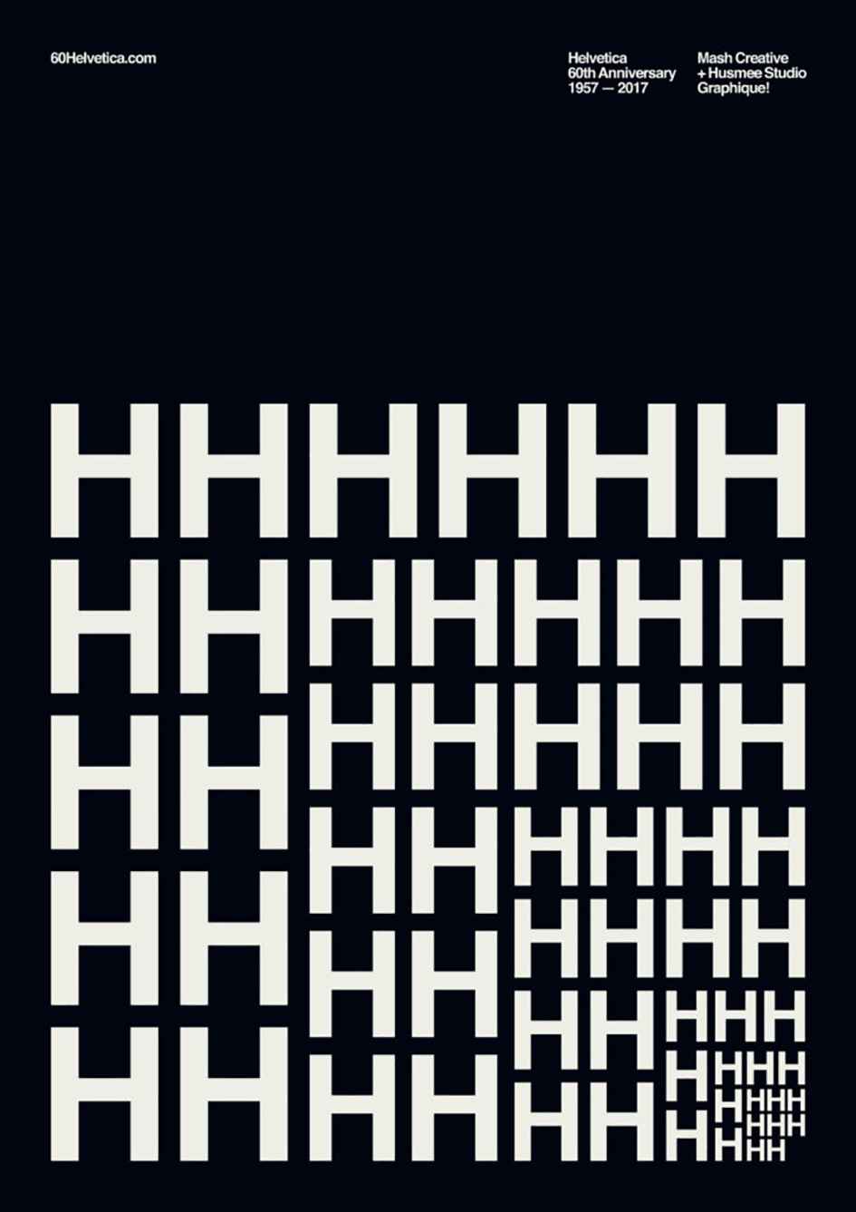
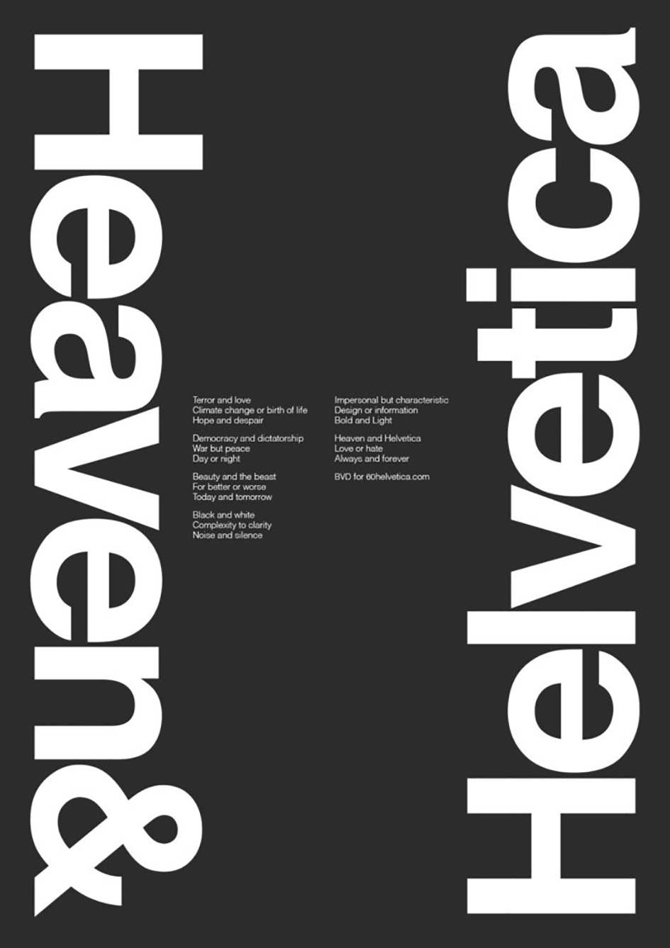
Poster by Mash Creative
Its use became a hallmark of the International Typographic Style that emerged from the work of Swiss designers in the 1950s and 60s, becoming one of the most popular typefaces of the 20th century. Over the years, a wide range of variants have been released in different weights, widths and sizes, as well as matching designs for a range of non-Latin alphabets. Notable features of Helvetica as originally designed include the termination of all strokes on horizontal or vertical lines and unusually tight letter spacing, which give it a dense, compact appearance. Developed by the Haas’sche Schriftgiesserei (Haas Type Foundry) of Münchenstein, Switzerland, its release was planned to match a trend: a resurgence of interest in turn-of-the-century grotesque typefaces among European graphic designers that also saw the release of Univers by Adrian Frutiger the same year. Hoffmann was the president of the Haas Type Foundry, while Miedinger was a freelance graphic designer who had formerly worked as a Haas salesman and designer. Miedinger and Hoffmann set out to create a neutral typeface that had great clarity, no intrinsic meaning in its form, and could be used on a wide variety of signage.
Originally named Neue Haas Grotesk (New Haas Grotesque), it was rapidly licensed by Linotype and renamed Helvetica, being similar to the Latin adjective for Switzerland, Helvetia. The font name was changed to Helvetica in 1960.
Check the tributes here
Poster by Atlas
Poster by Build
Poster by BVD
Poster by Graphéine
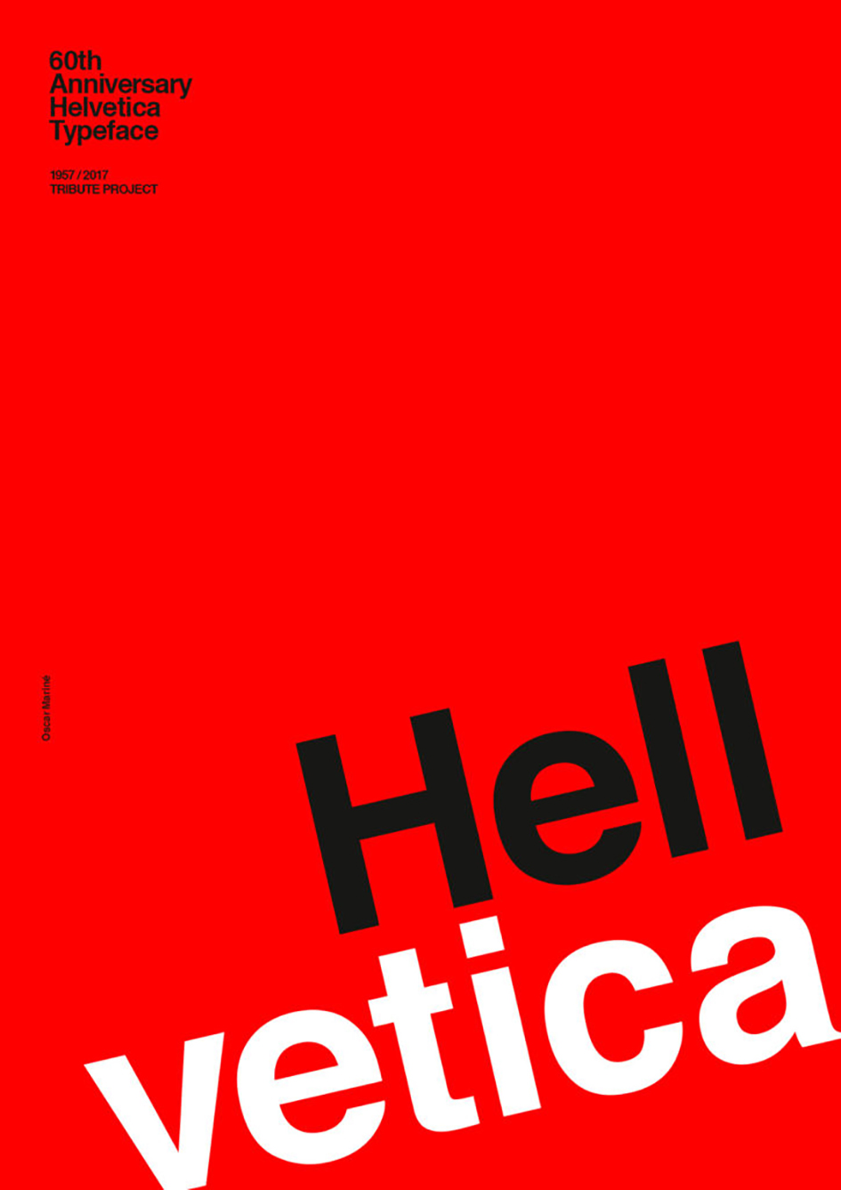
Poster by Oscar Mariné
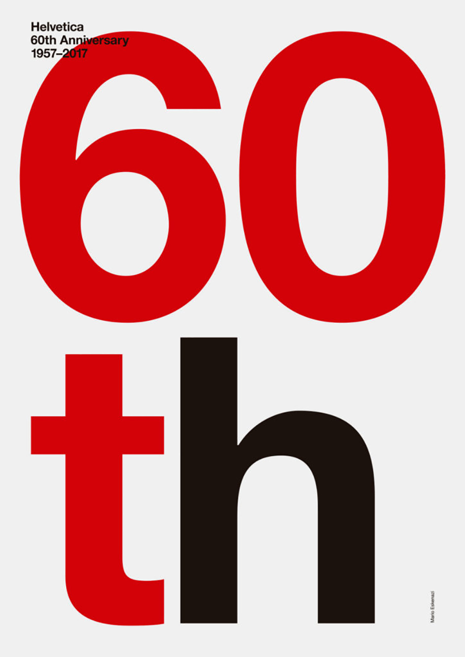
Poster by Mario Eskenazi
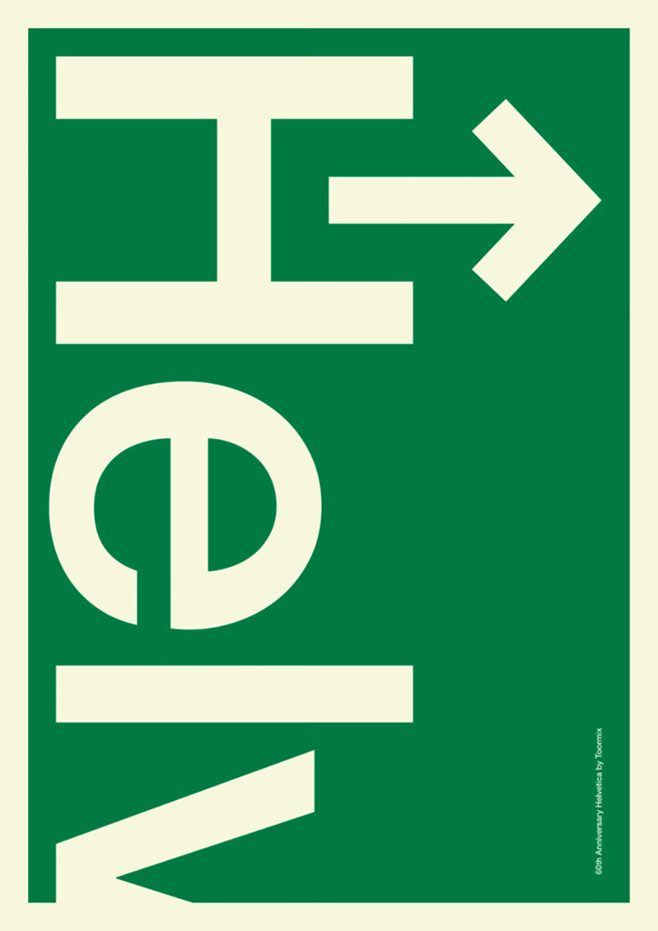
Poster by Toormix
Source: typeroom.eu © 2017 All rights reserved. Typeroom is published by Parachute®
MORE ABOUT FONTS: FUTURA / LETRASET /