ERIC SPIEKERMANN ON PG8A’S INNOVATIVE REVIVAL OF THE LETTERPRESS.
Since the advent of computers in our studios, we’ve all spent hours looking for the right typeface from thousands of choices, fussed with tiny increments in size, introduced refinements in OpenType fonts containing hundreds of ligatures, alternate characters and content-sensitive positions. And now ‘letterpress’ is back” writes Erik Spiekermann, one of the many renowned designers who is working with p98a, an experimental letterpress workshop in Berlin Tiergarten for a revival of this old technique into something new. “Suddenly we’re happy to take a lowercase l and use it for a figure 1 because that particular typeface doesn’t have enough figures? WTF? Wood type sucks when it comes to kerning because you would have to cut away bits of the letter itself in order to achieve ‘perfect’ spacing… Why do we bother?” he argues. Of course, he is more than willing to shed a light on the newly launched exploration of letterpress in the 21st century through p98a.
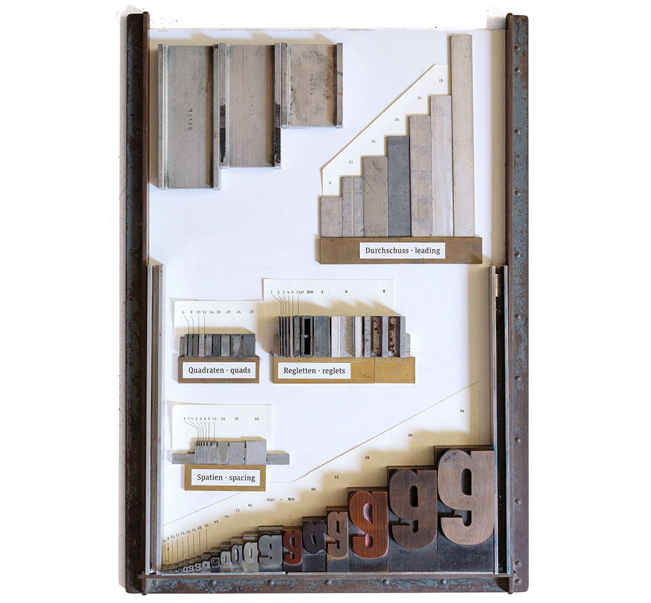
“The elements of the typographic system: type and the stuff in between (which is not invisible until you print the page).”
“Nobody who has ever held a large piece of wood type has been able to resist the fascination that these objects evoke. There is nothing like setting up a forme (yes, with a silent e at the end) from bits of lead, steel, aluminium, brass and wood – a very messy sight, as these materials have all been around and aged differently – and then running a clean white sheet of paper through the press and over that colourful forme. Suddenly and quite magically, there is a message: words on paper, exactly where you wanted them” he adds before laying out three practical reasons on why he is one of the many designers, alongside Ferdinand Ulrich, Norman Posselt, Axel Nagel, Jan Gassel, Alexandra Pawłowska, Laureen Mahler, John Peck and Susanna Dulkinys to name a few, to collaborate with p98a:
“1. A lot of the more than 800 cases of display type in our workshop, (not all of it is made from wood), have characters missing, damaged, not available in sufficient amounts. And, of course, nobody had a need for hashtags, @-signs, €-characters or other recent additions. Fonts from the US or Britain don’t have the umlauts like ä, ö, ü and other accents that languages beyond English require – it being the only language that manages without any diacritical marks. So we need to make new letters to complete or augment the character count.
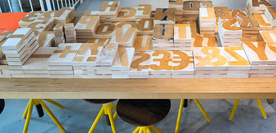
“A table full of HWT Artz in 40 cicero size, just arrived in Berlin from Two Rivers, Wisconsin.”
Accents above the cap height are unpractical: they prevent lines from being set closely and are hardly used in English. German poster type like that Block Heavy shows inventive solutions to that problem. When I designed Artz for Hamilton, I copied what the old guys had shown us. The lines around the characters show the body of the type. This is where the woodblock gets cut.
Wood type is cut as closely to the face of the character as possible, just a fraction from the deepest or widest point.
2. Some of our favorite type is only available in one or two sizes, and often not the one we would like to use. So we need to make other sizes for the same design.
3. There are fantastic new typefaces being designed today that look really good in large sizes. We don’t always want to evoke the old times by using type that was designed more than a hundred years ago. Instead, we want to move letterpress out of the nostalgic niche where is has been sitting since its revival through the application of polymer plates. When we make new digital designs available as large display type, we can decide which characters we want, which size exactly and how many of them”.
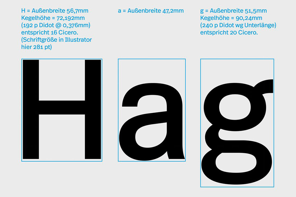
“The measurements for the 16 cicero font of Real Wood.”
“For a typedesigner like myself, giving my digital design a physical existence adds another level of experience” adds Spiekermann. “I hope other designers will also soon discover the joy of actually holding their letters in their hands” he comments.
p98a is an experimental letterpress workshop in Berlin dedicated to letters, printing and paper. Spiekermann, Ulrich and the likes, work with the studio’s hot metal – and wood-type, several proof presses, a Heidelberg »Windmill« platen and other traditional analogue equipment and combine those with digital technologies.
“The letters were cut in Maple wood with a CNC router, directly from the data supplied. The first attempts with a CNC router were not good enough. We tested different woods and methods.”
“We expose polymer plates, cut large size type from digital data, mill punches to make matrices for casting new hot metal type and will be 3d-printing poster type as soon as the materials become affordable. We use a direct-to-plate process to output digital plates for letterpress-printing books at our friends’ shop Die Lettertypen. They have a Heidelberg Cylinder and a large 1924 Johannisbergerstop-cylinder press, plus lots of other machines for typesetting, printing and finishing. We have more than 500 cases of wood type from 8 to 60 Cicero (the German equivalent of a »line«, aka 1 pica, but about 7% larger) and around 450 cases with foundry type from 6 to 96 point. The Linotype machine has 56 magazines from 6 to 18 point. Our digital Risograph is used to print small publications with spot colours, like our own p98a Paper”.
To explore more of why everything old is new again click here.
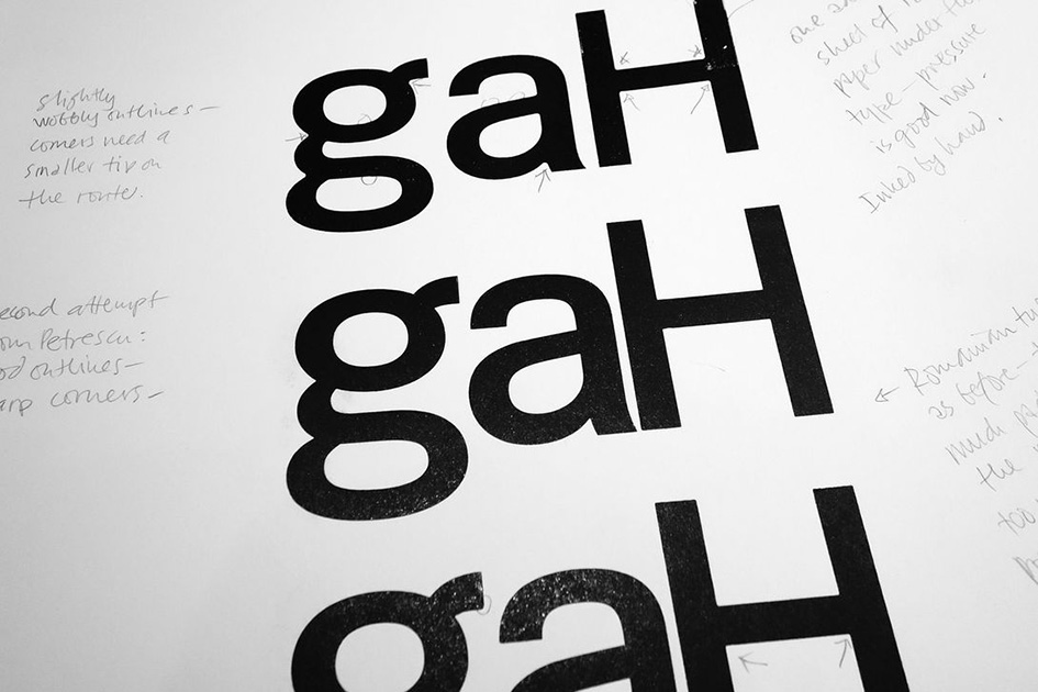
“The only way to really see what works is to make a few letters and actually print them under production conditions.”
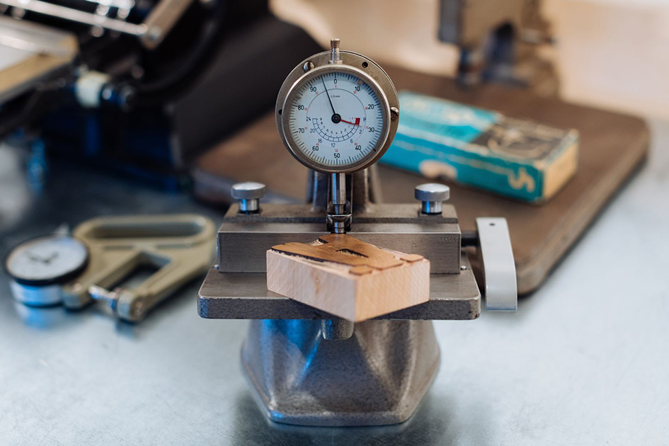
“Precision is a major concern. We’re always amazed as how even the slightest irregularity will look bad once printed on paper. We have lots of measurement tools. This shows the first “beta” run from Hamilton coming 0.06mm short of the required height. You can see the standard of 23.566mm engraved on the tool. The next batches from Two Rivers turned out much better.”
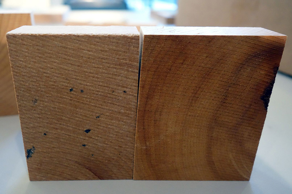
“Wood type has to be the right height, the right size and it also has to be cut square or else it’ll be impossible to compose properly locked formes. These two characters do not pass the test.”
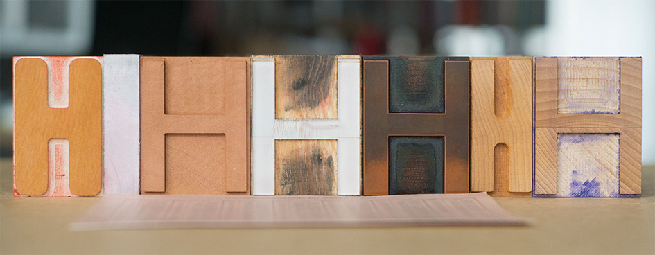
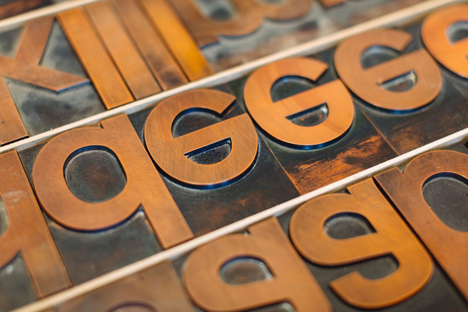
“You can see from this row of test characters how much letters can deviate from the size required. The standard size is given by the piece of aluminium furniture on the left, between the first two letters.”
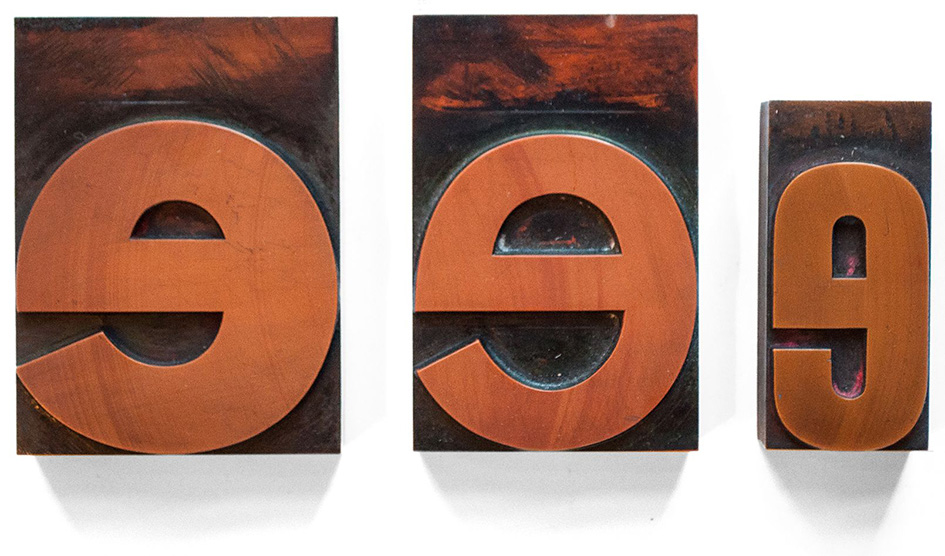
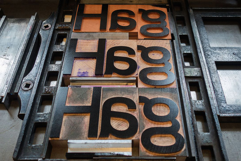
“Berthold Akzidenz Grotesk Bold, Medium and Condensed in 20 and 12 cicero, made from Plakadur.”
“Only four lower case letters e in our 20 cicero Akzidenz Grotesk Medium font. With large type like this, it always pays to count your letters before you start setting. Except in this case, the bug became a feature.”
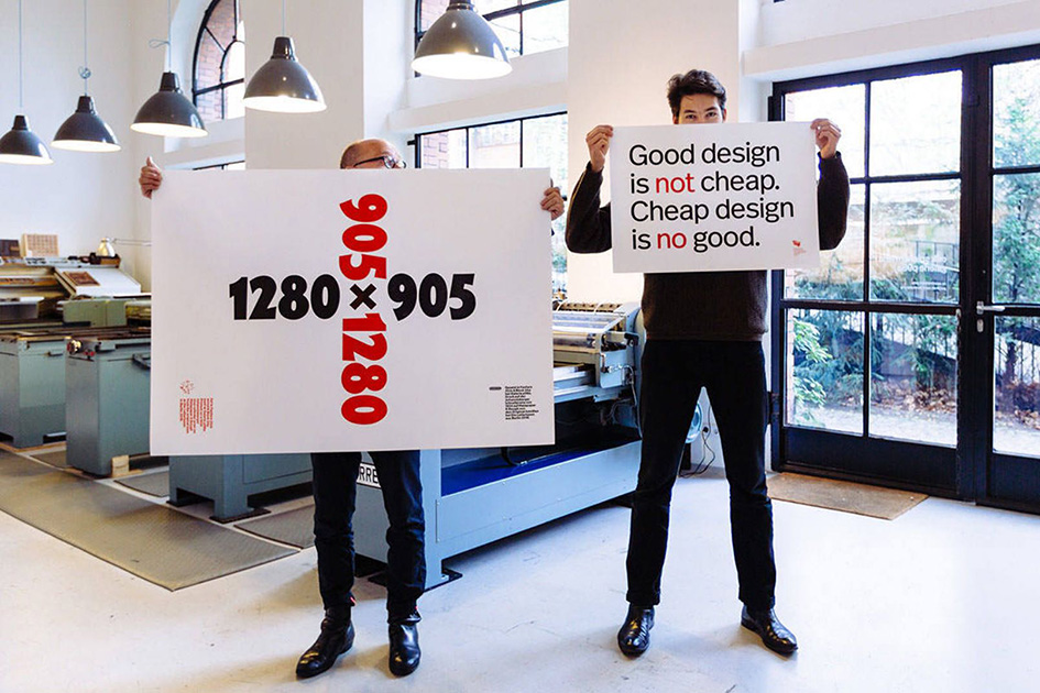
“Erik and Ferdinand holding up posters printed at p98a, both from original wood and metal type.”
Source: typeroom.eu © 2017 All rights reserved. Typeroom is published by Parachute®